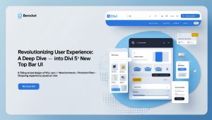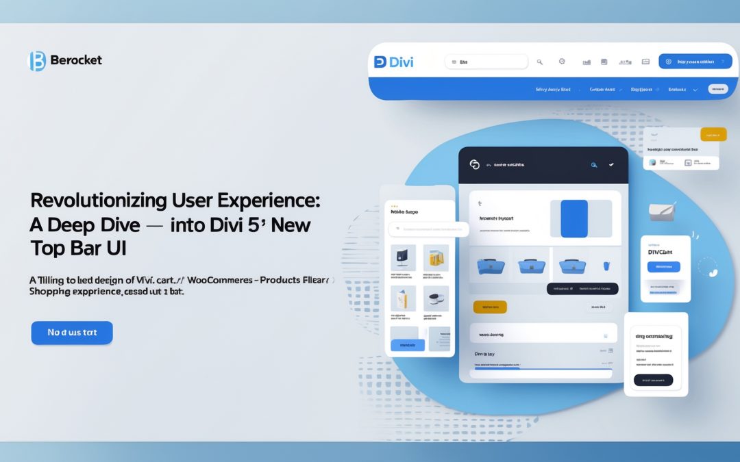
Unpacking the Revolutionary Top Bar UI of Divi 5
As a seasoned user of page builders, I’ve often found myself ensnared in the maze of confusing interfaces and cluttered toolbars. My intimate love affair with Divi has been well-documented, so when I caught wind of Divi 5’s revamped top bar UI, it was like receiving an unexpected text from an old flame — intrigue mixed with a bit of anxiety. Would this latest update reinforce my long-standing loyalty, or would it send me stumbling into the realm of bewilderment? After a thorough exploration, I can confidently say the new Top Bar has ushered in a wave of clarity that makes editing feel like an effortless dance rather than a clumsy ballet.
A Reorganization Worth Celebrating
The essence of the new top bar lies in its meticulous reorganization — a clever act of decluttering that highlights the tools I use most often without the unnecessary clutter of bygone digital baggage. It’s a bit like going through an overcrowded closet and pulling out only what brings joy (**thank you, Marie Kondo**). 🧹
Previously, the array of editing options could leave anyone feeling flustered, like trying to read a menu written in Esperanto while hangry for a good meal. Now, I find the tools I’ve come to rely on have been grouped more intuitively. The layout promotes faster navigation, and suddenly, working on my projects feels as fresh as that first sip of coffee in the morning—invigorating and highly productive.
What’s Where: The New Top Bar Breakdown
Let’s not beat around the bush here; clarity is king, and Divi 5 delivers with its well-thought-out organization. 🗂️ Take a stroll with me through the revamped top bar, where understanding is key. Here’s where everything lives now:
1. **The Central Control Panel**: At the heart of the top bar lies the control panel, housing essential tools I need to edit effortlessly. The magic lies in the segmentation of controls into clusters depending on their function—design, content, and layout. Think of it as a well-timed plot twist in an otherwise predictable film.
2. **Clearly Defined Sections**: Each section is clearly labeled, which means that I can now find what I’m looking for without playing hide and seek with Divi’s features. The absence of overcrowded icons allows me to focus on creativity rather than hunting through noise and distractions.
3. **Quick Access Shortcuts**: Another addition I truly appreciate is the implementation of quick access shortcuts. Pressing a button to get to tools I often use? Now, that’s the sort of convenience that turns repeated mundane actions into a breeze. 🌀
4. **Easier Collaboration**: If there’s one thing I love more than crafting solo masterpieces, it’s collaborating with my team. The new top bar’s clear layout facilitates working alongside others seamlessly — no more lost messages or “Where did we put that?” moments.
A Call to Action for Creatives
I stand behind the notion that evolution is requisite for greatness. With the new top bar UI, Divi 5 is certainly leading the charge in maintaining its reputation as not just a page builder, but a platform that fosters creativity and easy collaboration. This update isn’t merely cosmetic; it’s like fresh paint on a well-loved canvas, making the entire experience that much more pleasant. 🎨
If you’ve historically steered clear of Divi due to previous complexities, or simply felt overwhelmed by the interface, this might be the perfect moment to reconsider. The thoughtful ergonomics of this update empower users to dive into the creative process without second-guessing. I genuinely believe that, with a bit of practice, the new design will unlock greater potential for both seasoned and novice users alike.
Looking Forward
In our fast-paced digital landscape, every second counts. The time I’ve saved thanks to this revamp has propelled my projects forward, allowing me to focus on what truly matters: content, creativity, and storytelling. I can’t help but feel excitement about the future of Divi with this sophisticated overhaul.
In the end, the new top bar UI of Divi 5 feels like a solidified handshake—a mutual understanding between the developers and users on what we all need. I know that I’ll latch onto this innovation, a perfect blend of ease and creativity, and dive deeper into my projects with renewed vigor. If there’s one thing the world of web design craves, it’s streamlined efficiency combined with artistic flair. This update is a stunning entry to that niche, and I—like many others—will be hanging onto its coattails for dear life. 💪
So, here’s my advice: Embrace the change, dive in and let yourself be surprised at how much easier creating stunning web pages can be. After all, we all deserve a workspace that complements our innovative spirits!