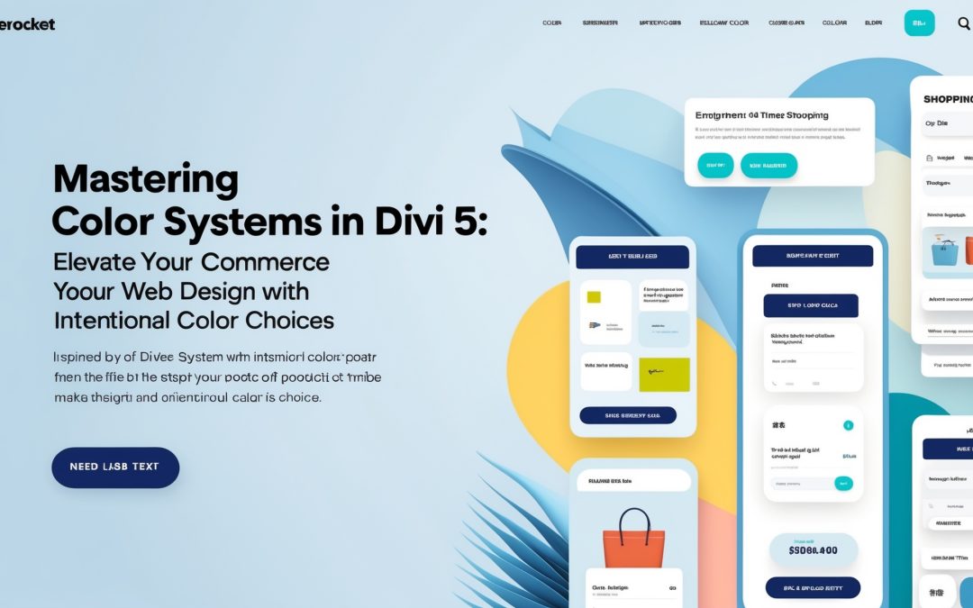
Mastering the Art of Color Systems in Divi 5
As a professional in the ever-evolving world of web design, I understand that random color choices rarely lead to a cohesive design. Think about it: a website that looks like it was pieced together by a toddler with a box of crayons might attract some chuckles, but it won’t win any awards. If you’re serious about your craft, you need to embrace the challenge and develop an intentional system for choosing colors. 🎨
This is where Divi 5 and its revolutionary Color Management and Design Variables come into play. They allow you to create a color system that not only enhances visual appeal but also ensures consistency across your projects. So, let’s dive into the nitty-gritty of how to create a stunning color system that reflects your brand’s identity while keeping the user experience in mind.
Understanding the Color Management Feature
Let’s start with the fundamentals: Color Management in Divi 5. The system allows you to define a robust set of colors that can be accessed throughout your website, directly from the Visual Editor. This isn’t some wishy-washy color picker that gives you a headache; oh no, this is structured and purposeful. 🚦
When you first access the Color Management tools, you’ll notice a clean interface that invites you to experiment, but it’s not about aimlessly slapping colors together. Instead, we’re talking about creating a palette based on your brand’s essence.
**Palette Selection**
Choosing a color palette is like choosing a signature scent; it should reflect your personality and create a lasting impression. I recommend selecting a primary color that embodies the spirit of your brand. Back that up with secondary and tertiary colors that complement your primary choice. This is crucial because a harmonious palette will guide your visitors effortlessly through your content.
Types of Colors to Use
1. **Primary color**: This is the star of your show—the color that captures attention and sets the mood. It should be bold, yet not overwhelming.
2. **Secondary colors**: These support your primary color; think of them as your brand’s wingmen. They should enhance, not overshadow, your key hue.
3. **Accent colors**: Used sparingly, these colors are the confetti on your design cake. They should grab attention for buttons or call-to-action elements but maintain balance.
Innovative tools within Divi 5 also provide options for exploring different shades, tints, and tones of your chosen colors. By manipulating the shades, you can add depth to your design without losing the essence of your brand.
Design Variables: Your New Best Friend
After you’ve settled on your color palette, let’s talk Design Variables—a marvel that transforms the way you manage colors in Divi. Instead of manually adjusting colors on each individual module, Design Variables allow you to apply your beautifully crafted color system universally. Imagine the time saved! ⏰
You can make global changes in a heartbeat, ensuring that any shift in your design philosophy reflects throughout your entire site. Talk about efficiency!
Simply define your color variables, choose the modules they will affect, and like magic, every element that uses those variables will adapt to your new vision. No more headaches from trying to keep track of inline styles, you can create a color system that is both manageable and scalable.
Implementing Your Color System
Now that you have your colors set up and your Design Variables in place, implementation is where the real fun begins! Using the Visual Builder, you can effortlessly integrate your color system across your site.
You will notice, for instance, that as soon as you change a color in your design variables, that change ripples through any element using that color—headers, buttons, backgrounds, you name it! It’s exhilarating to watch your website morph into a unique creation that feels intentional rather than haphazard.
Creating Cohesive User Experiences
Remember, the goal of your color system isn’t merely aesthetics; it’s about enhancing user experience. Your site should guide visitors’ emotions and reactions through strategic color placements. I firmly believe that colors can evoke feelings—warm reds can ignite excitement, while calming blues invite tranquility. Use this knowledge to craft a journey for your visitors.
Feedback is also crucial; don’t hesitate to test your designs with real users. Their responses will provide invaluable insights into how your color choices affect their experience. Fine-tuning can be the difference between an okay design and a jaw-droppingly spectacular one.
Final Thoughts
Creating a color system in Divi 5 isn’t just about making things pretty; it’s about crafting a journey that feels cohesive and connects with users. By thoughtfully selecting your colors and utilizing Divi’s Color Management and Design Variables, you will have an arsenal that empowers your design process like never before.
It’s easier than you think, and once you start, there’s no looking back! Start today, create that dazzling website, and turn your random color chaos into a harmonious masterpiece. Now, armed with the right tools, go forth and color your way to success! 🌈