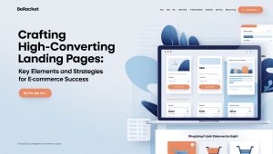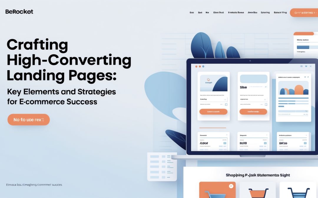
Creating High-Converting Landing Pages for E-Commerce
I know that in the treacherous waters of e-commerce, where countless brands and shops compete for the attention of the consumer, creating a landing page that captures interest is akin to finding a needle in a haystack. A high-converting landing page is not just a visual treat; it’s a meticulously crafted experience designed to convert fleeting visitors into loyal customers. 🛒
In this blog post, I will delve into the key design elements, proven layouts, and impactful real-world examples that can dramatically enhance your landing page and, ultimately, your conversion rates.
The Anatomy of a Compelling Landing Page
First and foremost, let’s dismantle the structure of a successful landing page. Think of it as a beautiful machine—each cog and gear playing a pivotal role in the overall operation.
– **Attention-Grabbing Headline**: Within mere seconds, your headline should seize the reader’s attention. This is where you establish a promise or present a solution to the visitor’s problem. It’s not just about being clever; it’s about being relevant.
– **Engaging Subheadline**: Once the headline hooks your audience, reinforce their interest with a subheadline that complements it and adds further clarity. It should act as the perfect shimmery bait that draws them deeper.
– **Compelling Visuals**: Visual elements should complement the tone and message of your landing page. Whether it’s a crisp product image, an infographic, or a video, quality visuals can make or break first impressions. I can’t stress enough the importance of high-resolution images that showcase your products in the best light—literally and figuratively.
– **Clear Call-to-Action (CTA)**: With all the noise and distractions online, your CTA is the lighthouse guiding the way to conversion. This button or link should stand out and prompt immediate action. Phrases like “Buy Now” or “Get Started” create a sense of urgency and incite the visitor to take action.
– **Social Proof**: Whether it’s testimonials, user reviews, or trust badges, social proof provides the backbone of credibility. Visitors are far more likely to convert if they see that others have had a positive experience with your product.
Proven Layouts that Drive Results
As I peruse various successful e-commerce websites, I come across several tried-and-tested layouts that can skyrocket your conversion rates.
– **The Classic “Above the Fold” Approach**: A timeless favorite—placing critical components (headline, visuals, CTA) above the fold ensures that visitors don’t have to scroll to engage with your primary selling points. It’s the layout for those who can’t wait.
– **The Split-View Strategy**: Utilizing two halves of the page can be visually engaging. You can promote two different products, services, or even features side by side. This encourages visitors to make choices—a behavior rooted in behavioral psychology.
– **Storytelling Through Sequential Pages**: Instead of cramming everything onto one page, using sequential pages allows you to guide the visitor through a narrative. One page could feature a story with visuals, and another page could focus on product benefits, leading to a potent CTA.
Real-World Examples that Inspire
I’ve sifted through the myriad of e-commerce sites to find the standouts that truly exemplify great design and functionality.
– **Dropbox**: Their landing page is simple yet effective. The message is clear, and the CTAs are strategically placed. They offer an incentive (a free trial) right off the bat, allowing visitors to sample the product before committing.
– **Airbnb**: Their use of vibrant imagery coupled with clear navigation is a masterclass in user experience. The landing page provides immediate value, enticing visitors to not just look, but also engage.
– **Evernote**: Their landing page efficiently highlights features while maintaining a clean design. The CTA is prominent, and they use contextual imagery to reinforce the writing.
Tools to Enhance Your Landing Page Performance
If you’re feeling tech-challenged, fear not; a plethora of tools can help ease the design process.
– **Unbounce and Leadpages**: These platforms allow non-developers to create stunning landing pages without knowing a shred of code. Drag-and-drop goodness means creativity is limitless.
– **Google Optimize**: This free tool helps you run A/B tests to see what forms, CTAs, and layouts work best for your audience.
In conclusion, landing pages are not just stagnant screens on the internet; they are powerhouses that can boost your e-commerce success. By implementing the right design elements, layouts, and drawing inspiration from real-world examples, you can create a landing page that has a fighting chance at conversion. Embrace the challenge, and I promise it will pay off in the long run. ✨